Logo
Primary Logo

The logo is designed to be used with the combined elements to create one logo.
No other combination, or form should be used, i.e. separating the letters or stacking the elements in ways not shown here.
The white logo is to be used on dark backgrounds where elements of the colored logo would become unclear.
Safe Zone
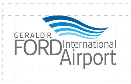
To ensure clarity of the logo, please leave the appropriate space around the logo as shown here.
Logo Misuse
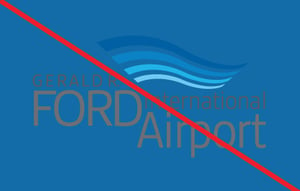
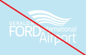
Always use the correctly colored logo for the purpose: the colored logo should not be used on dark backgrounds, and the white logo should not be used on light backgrounds.
Colors
Primary Colors
Hex: #2C5B9B
RGB: 44, 91, 155
Hex: #4481C2
RGB: 68, 129, 194
Hex: #67B0E5
RGB: 103, 176, 229
Hex: #A3D5F7
RGB: 163, 213, 247
Color Usage
The Gerald R. Ford International Airport primary color palette consists of a blue gradient. The majority of color used in materials for the Airport should be in these colors.
Take note of the Primary colors. The Gerald R. Ford International Airport logo should be reproduced in the specific primary colors wherever possible, with gray #6B6E6E for the text. If readability is an issue, the logo may be used in white. Never reproduce the logo in any other colors other then the primary colors you see shown here.
Secondary Colors
Hex: #6FCAD2
RGB: 111, 202, 210
Hex: #7FBD74
RGB: 127, 189, 116
Hex: #DDA858
RGB: 221, 168, 88
Hex: #C3773D
RGB: 195, 119, 61
Hex: #B44935
RGB: 180, 73, 53
Hex: #000000
RGB: 0, 0, 0
Hex: #6B6E6E
RGB: 107, 110, 110
Hex: #929496
RGB: 146, 148, 150
Hex: #B9BBBD
RGB: 185, 187, 189
Color Usage
The Gerald R. Ford International Airport secondary color palette consists of the colors listed above.
Secondary colors should be used as accents to the primary colors or where additional color is needed for clarity or stylistic variety. Secondary colors should never take up more than a combined 50% of any design or graphic.
Typography
Header & Body Font
Open Sans
Open Sans is the primary font for the Gerald R. Ford International Airport Brand. You can use varying weights in design layouts to differentiate between headings, subheads, body copy, numbering etc.
Imagery
Photography

Usage
Photography should highlight the airport’s campus and the greater Grand Rapids area.
Icons




Usage
Icons should be monochromatic and simple in design. The secondary color palette may be used for icons to contrast from the main color palette.
Messaging / Voice
Messaging
Getting there is better here.
At the Gerald R. Ford International Airport, we strive to take the stress out of flying for every customer. We value our customers’ time, are focused on their safety, and are working to make flying out of our airport as comfortable and cost-effective as possible.
Voice
The Gerald R. Ford International Airport voice is friendly and conversational. Think of how you would talk with your friends and loved ones.
Tone
All Gerald R. Ford International Airport copy should have a light, neighborly tone.
Assets
Videos
Resources
Links
Sales
- Lorem ipsum
- Lorem ipsum
- Lorem ipsum
Marketing
- Lorem ipsum
- Lorem ipsum
- Lorem ipsum
Design
- Lorem ipsum
- Lorem ipsum
- Lorem ipsum